GB reduced model
The NESO reduced GB model - interactive and in context.
The current centre piece of the site is a 28-zone representation of the GB transmission system derived from the NESO public release in DIgSILENT PowerFactory. It is important to note that the model released by NESO is a very simplified model, and combined the GB network into a series of smaller amalgamated and aggregated systems, but it is a useful research tool for representing complex systems behaviour, and can be used to give a flavour of the UK operating behaviour and performance.
The AI aspect of this work is a structured interface between the analysis AI and the PowerFactory implementation. This lets a study be set up, run and reviewed through engineering prompts rather than menu navigation, with the results filtered back into a form that can be assessed quickly. The map is one of the artefacts that comes out of that workflow. See Tools & Methods for how the work is organised and the case studies for what comes out of it.
The interactive map below combines synchronous inertia, demand, generation mix, 400 kV corridors, HVDC interconnectors and six dispatch scenarios in one view. Beneath it sits the context needed to interpret what the map shows, the model’s structure, the data behind each layer and the honest caveats that go with a reduced representation.
Live system state
Live system state - what it shows
The second tab keeps the GB Reduced Model skeleton - 28 zones, 400 kV corridors, HVDC links - and lays live data over the top:
- Per-site generator dots - every transmission-connected generator larger than ~100 MW with a known location, sized by current physical notification (PN) MW and coloured by fuel. Click a dot for the full unit-by-unit breakdown. Source: Elexon BMRS PN stream + a hand-curated BMU coordinate cache. Stays at “now” - does not scrub.
- HVDC interconnector chips - pinned to each cable midpoint, showing net flow MW, direction (↑ import to GB / ↓ export) and utilisation %. Source: BMRS FUELHH (per-link). Scrubs with the slider.
- Top strip - GB national fuel mix bar (transmission-metered, FUELHH-derived), CI value at “now” from carbonintensity.org.uk, and a total-generation tally. Scrubs with the slider.
- Embedded (now) - separate panel entry for embedded solar and embedded wind in MW, sourced from NESO’s
embedded-wind-and-solar-forecasts. These sit below distribution networks rather than the transmission system, so they are not in FUELHH but matter a lot - embedded solar can be 10+ GW on a sunny day. Shown for the current half-hour only.
The time slider in the panel scrubs back through the last 7 days at 1-hour resolution. Use the prev/next buttons for fine-grained stepping, the play button to animate the week, or “Now” to snap back. The fuel mix bar, HVDC chips, and FUELHH per-fuel totals all change as you scrub. The site dots stay anchored at “now”.
The bake refreshes via a scheduled rebuild four times a day (06:00 / 11:00 / 16:00 / 21:00 UTC). The timestamp in the top strip is what you are actually looking at - typically 30 minutes behind real time because that is the BMRS settlement-period lag.
A few caveats worth being explicit about.
Embedded generation isn’t dotted on the map even though it shows up in the totals. Embedded means anything connected at distribution voltage rather than the 400/275 kV transmission system - so almost all rooftop PV, the great bulk of utility-scale solar farms, and a long tail of small wind / hydro / battery sites. There are tens of thousands of these assets and the BMU registry doesn’t track them individually, which makes per-site dots impractical. They show up two ways instead: the top strip mix bar uses the Carbon Intensity API which already includes embedded estimates (Sheffield Solar PVLive feeds the embedded solar number), and a separate “Embedded (now)” panel shows the current national MW for embedded solar and embedded wind explicitly. So the picture is complete in aggregate, just not in detail.
Transmission BMU coverage is around 70 of the ~213 BMUs above 100 MW, so far. The control-panel labels show the FUELHH national totals so you can see, for any given fuel, what is running nationally versus what is plotted on the map. The geocoding cache grows over time; offshore wind and a few inland onshore farms are the main gaps.
The FUELHH-derived per-fuel MW in the panel is transmission-metered - embedded solar and embedded wind are not in it (see the explicit Embedded section instead). The top-strip percentage bar does include them.
East-West Interconnector between Wales and Ireland tends to read 0 MW on BMRS for extended periods, usually reflecting an outage. When that happens the chip shows “no data” rather than a misleading zero. Other interconnectors (Moyle, Greenlink) and the rest report normally.
Model context
What the model represents and how to read it.
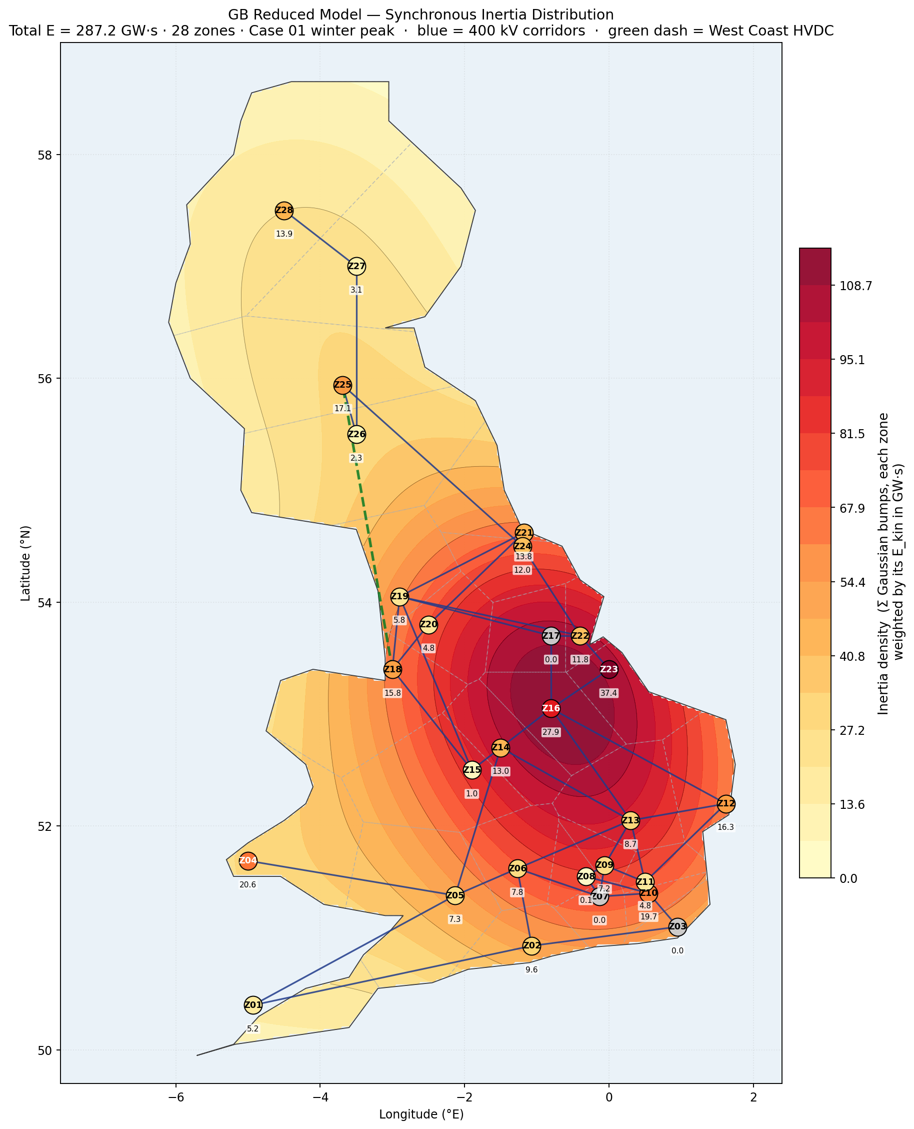
Purpose
The 28-zone representation of the GB transmission system should not be confused with the real system, it is necessarily simplified a great deal. It is intended to give researchers and developers a flavour of the UK system and allow research and development ideas to be generated and tested. For example the model shows a single line from Scotland (Zones 27 & 28) to North England - this is not correct, and there are multiple paths; however there is a well-known stability limit down these lines, which is represented by the aggregated equivalent.
The key value is that the 28 zone model it is a large enough system to see complex transmission effects and behaviours and look at issues like generation forecasting, broad dispatch scenarios, system strength, inertia distribution and exploratory what-ifs for increasing penetration of GFM technology or sudden changes in inertia. It is not really intended for formal RMS or EMT work that would be used to shape policy or operation.
Model structure
28 zones anchored at representative 400 kV substations, 46 retained 400 kV corridors plus the West Coast HVDC link and 10 interconnectors. Loads, generation across seven technology categories, and synchronous inertia are aggregated to zone level from the underlying PowerFactory project (326 machines). Each substation contains various generation technology types that can be configured for different generation loading cases and scenarios. The generation controllers are based on generic open IEEE and WECC models.
Filters allow heatmaps to be switched on and off for load and different generation types; key line ratings of the transmission system and HVDC links are also included. The map carries four baseline dispatch scenarios - winter high-wind, winter low-wind, summer high-RE, summer low-RE - plus two wind-constrained variants that curtail Scottish wind against a B6-style boundary to illustrate the effect on inertia and zonal balance. Six loading scenarios are considered:
- Winter High Wind (High Demand)
- Winter Low Wind (High Demand)
- Summer High Wind (Low Demand)
- Summer Low Wind (Low Demand)
- Summer High Wind (Low Demand) - Constrained by Inertia
- Summer Low Wind (Low Demand) - Constrained by Inertia
Each scenario carries scaled load and generation heatmaps, HVDC flow arrows, 28 draggable zone-summary cards, and (where applicable) a wind-constraint overlay
Assumptions and limits
Equivalent-machine inertia uses H = 5.0 s across all TypSym entries, giving ~287 GVA·s at baseline - on the high side; 230–260 GVA·s is more realistic with per-tech H. Summer scenarios currently capture the inertia envelope only; thermal boundary limits (e.g. B6) are not yet enforced. Offshore wind markers stay at baseline even under scaled scenarios.
Curtailment scenarios (5 & 6) consider minimum inertia levels given in the NESO FRCR of 110GVA.s. When time is permitting I will try and add more stability limits and realistic generation load cases.
Focused views
Single-purpose maps for specific questions.
The master map above combines everything. The lighter-weight views below render the same underlying data for a single question. Use the arrows to step through them - click "Open interactive version" to launch the live tool for the current view.